

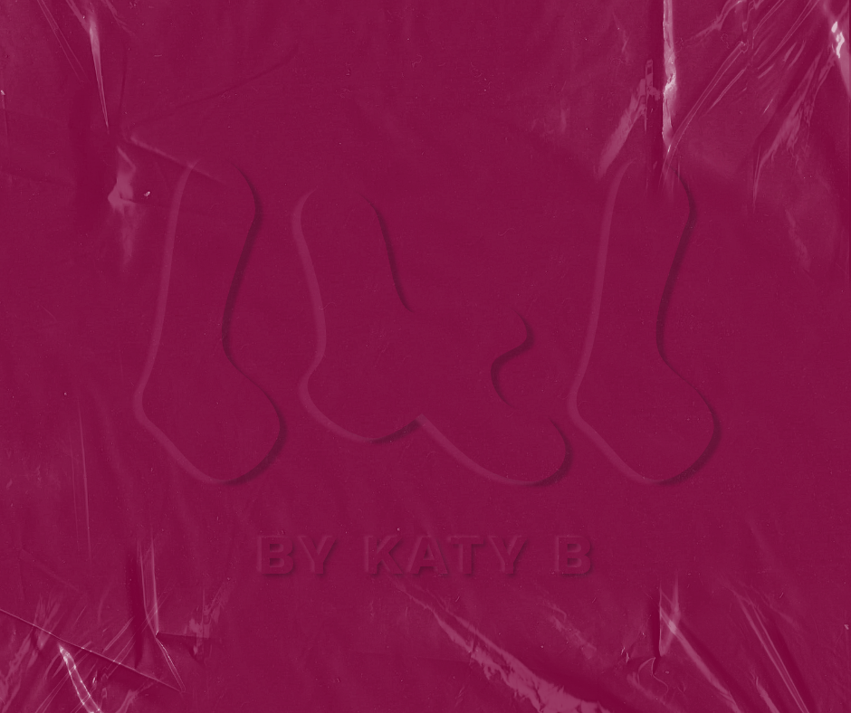
Behind By Katy B


Color Palette and Imagery
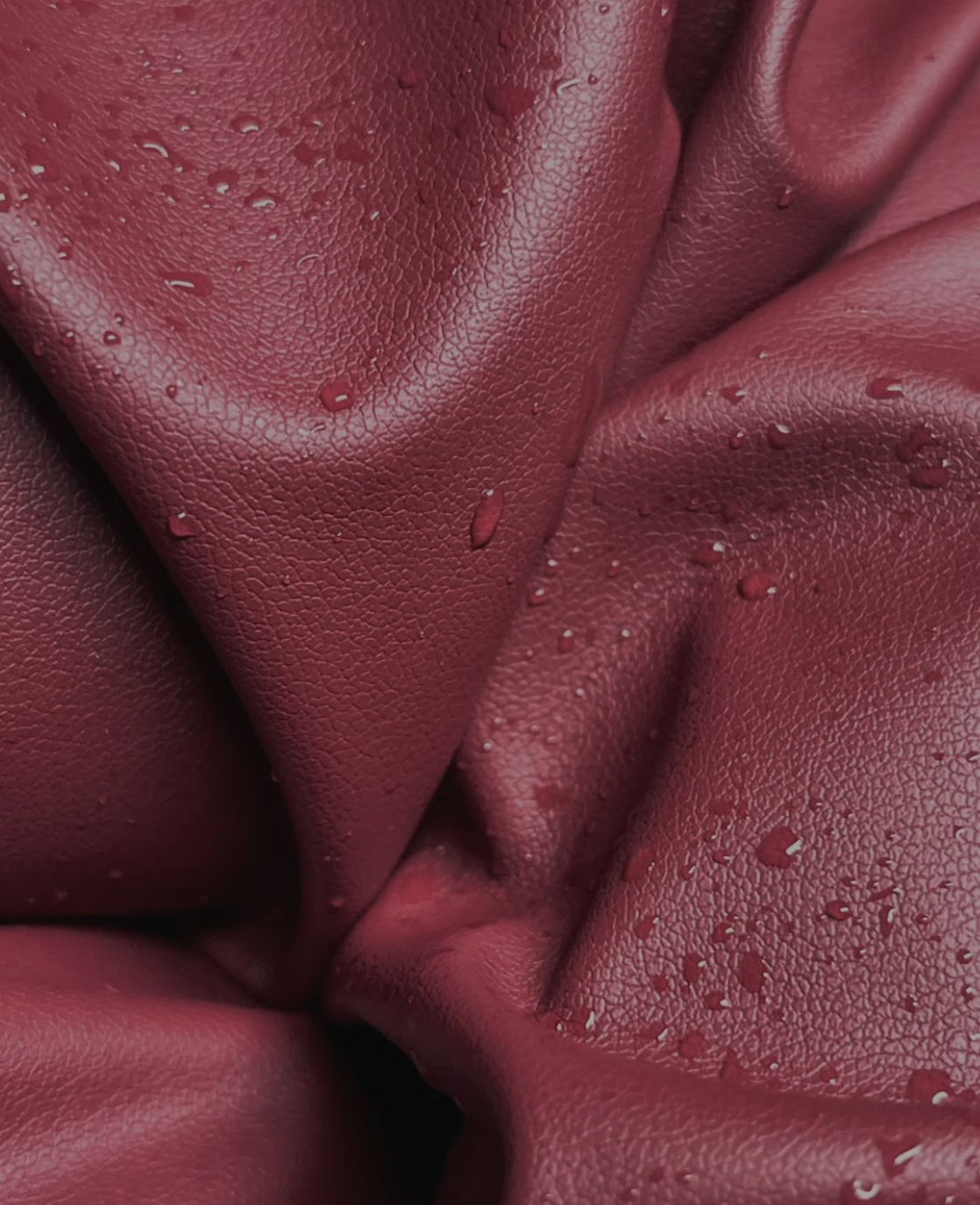
Maroon is more than just a color; it’s a feeling. It’s the deep, rich hue of a color that speaks of sophistication, wisdom, and quiet confidence. It’s the color of the Northwest—not the bright, sunny parts, but the cozy, grounded reality of the region.
It represents a grounded energy, a connection to the earth, and the strength that comes from a deep, unwavering passion. It’s the ambition that drives me, rooted in a love for the craft and a steadfast belief in quality.
At first glance, sand beige might seem like a simple, even boring, choice. But in its subtlety lies its power. This color is the sandy shores of the Oregon coast on a misty morning, the sun-bleached driftwood, and the smooth river stones. It’s a color of calm and timelessness, providing a neutral, elegant backdrop that allows the bold, passionate maroon to truly shine.
Sand beige represents my ability to create elevated visuals from what others might see as a blank canvas. It’s the quiet confidence in my foundation, the clean lines, and the refined simplicity that makes the elevated work possible.
Together, these colors tell my story. Maroon is the passionate and sophisticated artist, and sand beige is the grounded, thoughtful professional.


Typography and feel

With a whimsical and flowing design, my chosen font brings a sense of playful creativity to the brand identity.
The font has soft, rounded curves and lack of harsh lines embody a gentle, approachable elegance, inspired by modern, minimalist aesthetics but with a unique, fanciful twist.